The FetishMap

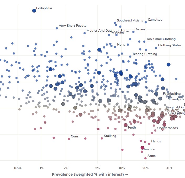
551 desires, charted. prevalence × sex skew.

Every fetish, kink and turn-on the Big Kink Survey asks about in enough detail to chart — 551 items placed by how common the interest is, how taboo people rate it (0 of the items), and who likes it more — compare any two groups by sex, gender identity, orientation, attraction (masc–fem and women–men), age, politics, mental health, partner count, ethnicity, upbringing, body weight or porn use. Put any two measures on the axes with the x / y pickers; population-calibrated weights throughout. Hover to inspect, click to pin, search or filter by category.

Advanced options

The extremes

click any row to pin it on the map

How to read this

Fifteen measures, any two of which can be the axes. Prevalence (log scale) is the weighted share of respondents with interest in the item. Tabooness (linear, 0–100) comes from two separate surveys and exists for 256 of the 551 items — the rest drop off the plot when that axis is selected. The other thirteen are "who likes it more" measures: for a demographic variable such as age, the page holds the item's rate at every level of that variable (14–17, 18–22, … 40–50), and the axis shows the ratio between whichever two levels you pick in the "compare … vs …" boxes. An item at 4× on the age axis with 40–50 vs 18–22 selected is four times as common among 40–50-year-olds as among 18–22-year-olds. Dots are inked by whichever non-prevalence measure is showing, or by the Advanced options → Heat map choice; the colour key under the plot spells out the current ramp. Large ringed dots are 1–5 arousal scales; small dots are checkbox options.

Why levels rather than a single "older vs younger" number: any one ratio has to choose two reference points, and that choice can halve or double the result — swinging is 2% at 14–17, 10% at 23–26 and 24% at 40–50, so "how age-skewed is swinging" depends entirely on which ages you mean. Keeping the whole curve means nobody is dropped from the middle, the ordering of the levels does real work, and the comparison is yours to make rather than baked into the data. Pin an item to see all thirteen curves at once, with 95% bands; the two big dots mark the levels currently on the axis. A level with fewer than 20 effective endorsers is shown hollow and is never used for a position — it's hidden as "too few people" instead of being smoothed or guessed.

The "vs. typical item" checkbox re-centres a skew axis on what the median item does rather than on a 1:1 ratio. This matters most for gender identity: trans and nonbinary respondents report more interest in almost everything, so the median item already sits around 2× and "equal" is a misleading baseline. Ticked, the centre line means no more skewed than the typical item.

The "hold other demographics constant" checkbox switches every curve from the rate people actually reported to a model-adjusted rate: a weighted logistic regression per item, with the same population weights as everything else, gives the rate at each level of a variable for people who are otherwise alike on sex, age, gender identity, ethnicity and religious upbringing (those five are adjusted for one another; the lifestyle and trait variables — orientation, the two attraction measures, politics, mental health, partner count, body weight, porn use — are each adjusted for the five but deliberately not for each other, so the sex comparison is never conditioned on porn habits). Use it to ask whether, say, the porn-use gradient is really just a sex difference in disguise. It matters most for the attracted-to axis: unadjusted, "attracted to masculine" mostly means "is a straight woman or gay man," so the raw ratio is close to a flipped sex axis — adjusted, it becomes the interesting question of whether liking masc vs fem partners predicts the kink within a sex. It is a statistical adjustment, not a causal claim, and it is off by default because the unadjusted rates are the ones you can check against the explorer.

Making scales and checkboxes comparable: a checkbox is a blunter instrument than a 5-point scale, so we calibrated the cutoff with the Scale Explorer experiment, which asked the same items as a checkbox, a 4-point and a 7-point scale to randomized arms. The share of people who tick a plain checkbox matches the share who rate the item ≥3 of 5 — so scale items here count a person as interested at 3+, not at "mild interest" (2+).

Weighting: hardweight, the Big Kink Survey's aggressive population calibration (raked to census/benchmark targets on age × sex × LGBTQ, politics, ethnicity, BMI, mental health, abuse history, religiosity and partner count; see the explorer's methodology). 527,931 respondents aged 14–50; every dot has ≥200 endorsers. Note the aggressive weighting costs precision: the unequal weights make those 528k people worth an effective sample of n ≈ 41,937 for the weighted percentages (design effect ≈ 12.6), which is the figure quoted above the map — plenty for the map, but per-item weighted estimates behave like they came from a 42k-person survey, not a 528k one. The emotion signatures and the endorser counts in the tooltip are unweighted, so raw n applies to them.

The two attraction measures come from two different survey questions. Attracted to: masc–fem is the seven-point "you're more sexually attracted to people who appear visually … totally feminine → totally masculine" item. Attracted to: women–men combines the genital question ("you're sexually attracted to people with … penises / vaginas", which the explorer carries as orientation once crossed with the respondent's sex) with that presentation item: women = straight men and gay women who also lean feminine on the slider; men = straight women and gay men who lean masculine; both / mixed = bisexual respondents, or anyone whose two answers disagree or who sits at the midpoint. Unadjusted, both are close to a flipped sex axis (most people attracted to men are women); the "hold other demographics constant" view is where they become informative, because it asks whether the partner someone wants predicts the kink within a sex.

Two honest caveats on the demographic measures. First, they are correlated with each other: trans/nonbinary, younger, non-straight, more-mentally-ill and heavier-porn-using respondents over-report a similar cluster of items, so thirteen axes are not thirteen independent findings — the adjusted view is there precisely to help separate them. Second, the ethnicity measure also picks up plain own-group attraction (non-white respondents rate the non-white attraction checkboxes higher), which is not a kink finding. The aggressive population weighting makes some groups small in effective terms — trans and nonbinary respondents are 60,360 people but only about 2,800 effective ones — which is why thin cells are hidden rather than shown.

Tabooness is a rating of how taboo the thing is believed to be — a judgement about society, not the rater's own arousal, and not this survey's respondents. It merges two separate Aella surveys: one placing items on a 0–5 "not taboo → extremely taboo" scale (n ≈ 1,100–2,100 ratings per item), the other asking a 0–100 slider "how taboo is X?" (n ≈ 160–2,000 per item). Items were matched between surveys and to this map by meaning, not wording — one survey's "inserting things into the urethra" is this map's "Sounding" — and every match was hand-checked. Where both surveys cover an item their ratings agree closely (r = 0.94 across the 57 shared items), so the 0–5 scale was linearly calibrated onto the 0–100 one and the two were combined by inverse-variance weighting; 57 items draw on both surveys, 161 on the slider survey alone and 38 on the 0–5 survey alone. The taboo raters are a different, much smaller and more online sample than the 528k who reported their own interests, and where a survey asked separately about male and female (or giving and receiving) versions of the same thing, those were averaged into one number.

The emotion signature (in the tooltip and detail panel) comes from two survey questions: which emotion you most want to feel during sex, and which you most want the other person to feel — one pick each from 22 emotions. For each item we show the emotion most distinctively over-picked by its fans, with its lift over the population base rate ("3.7× base" = fans pick it 3.7× as often as everyone). Naively taking fans' most-common emotion returns Eagerness or Love for nearly every item (they dominate the base rates), and raw lift returns Despair for nearly every item (it's so rare that any dark fetish inflates it) — so winners are ranked on shrunken log-lift centered against each emotion's typical enrichment across all 551 items, and must clear lift ≥ 1.1, z ≥ 2 and ≥ 25 fan picks. Signatures are computed within each sex — an item's male fans are compared against male answerers and its female fans against female answerers, so sex differences in emotion base rates (women pick Powerlessness twice as often as men; men pick Love and Power more) don't masquerade as fetish signal. Computed unweighted, as a correlational measure. The emotion filter above the map matches an item if any of its four cells (men/women × feel/other) carries that emotion; a "—" cell means no emotion cleared the bar for that group.

One honest caveat: checkbox items were only shown to people who opened that category's page in the survey, so their denominators are category-openers rather than everyone. The calibration fixes the threshold semantics but not that exposure difference — checkbox prevalences for obscure categories run somewhat hot relative to the scales.